Monday, April 30, 2018

Cindy Sherman


This picture is called "Untitled #16," and was created in 1978. I love the angle of this photo and the fact that it reminds me of Breakfast at Tiffany's. The expression she has on her face in in between actions, as Cindy described in her interview with Art21. This picture makes me feel as if this woman is in charge of the conversation, as if she has some importance. I also feel like the shot is slightly tilted, which keeps the eye moving.

Cindy Sherman

Untitled #466 by Cindy Sherman
This picture is meant to depict a wealthy woman in Sherman's "Society Portraits,"series presented in 2008. Sherman meant to photograph herself as a stereotypical older wealthy women. I like this photograph particularly because of the look she's giving the camera. Her body language and pose makes me feel like she's giving a condescending look toward the viewer, symbolizing her idea that she is far above my status. I appreciate the specificity of the clothing to match the background, giving the setting of a warm climate and building full of rich architecture. I feel like Cindy Sherman really captured the essence of societal stereotypes. 

Sunday, April 29, 2018

Jack Whitten

This work is called Untitled by Jack Whitten made in 1964. Jack is known for his experimentation with different painting materials such as eggshells, copper and styrofoam. He is known for  creating unique textures and cultural references. This work is pastel on paper and i found it interesting because at first glance you can see these two figures staring at you immediately. I think it is intriguing that the black and orange outline is what really details the faces. He also has another artwork called untitled which follows the same idea with the faces but he used brighter colors.

Wednesday, April 25, 2018

Jack Whitten


This painting by Jack Whitten looks amazing. It reminds me of one of the great pyramids of Egypt. I love the mix of colors and how the pyramid is completely dark. I am also a huge fan of the art in front of the pyramid. It almost looks like the images are egyptians dancing. Overall, the image looks astounding and I am eager to view more like it. 


jack whitten


The painting is by Jack Whitten who is an African American artist from the south, who moved to New York. The painting is untitled. I like this painting because it shows to faces but it is very abstract. I like all the colors that were used and they he kind of hid the faces in the painting. I like the way he used the colors. Nothing is consistent throughout the image. I really like how it pops.

Jack Whitten


Jack Whitten completed this beautiful piece of artwork towards the end of his career in 2011.  This piece was painted with acrylic paint on a hollow-core door. Towards the end of his profession, he decided to broaden his creativity into the digital technology world. This piece above is title Apps for Obama which encapsulated Jack Whitten's vision of what President Barack Obama's iPad might consist of. I like this painting because you can see the detail and effort he placed in this painting to create each segment of this artwork. Also the color schemes are so perfect that it makes the painting look so real. 

Jack Whitten

This mosaic looks like something I would see under a microscope. This work is a memorial work made for an African American photographer Roy DeCarava. I really like the contrast between the black, white and gray. It is so amazing that this a collage painting. W

Jack Whitten

Black Monolith II  Homage to Ralph Ellison The Invisible Man by Jack Whitten. He made this in 1994. This is made of molasses, copper, salt, coal ash, chocolate, onion, herbs, rust, eggshell, razor blade. The reason i liked this piece of work is because it is made of so many cool things. To me the piece of art looks like a persons silhouette but if you keep looking at it you can imagine so many more things. As i was looking through his work i really loved most of it!

Garden in Bessemer

This oil canvas painting is titled Garden in Bessemer VI by Jack Whitten and was created in the year 1968. I really love the vivid colors used in this painting and think it looks like organized chaos. It has so much going on and together creates a nice piece of artwork. If you look up close you can identify faces within the painting.

Jack Whitten

Self Portrait 1 was the first self portrait created by Jack Whitten in 2014.  As you an see, it isn't like typical self portraits as the outline is in the shape of a head but it is not filled with facial characteristics.  Inside you can see small abstract shapes and it is contrasted by a black background.  By looking at this, you can see that it is not obvious that it is a human form. That makes many people wonder what was going through Whitten's head in 2014 when this piece was created.  I personally love how it is in the shape of a head but with no facial characteristics, it adds a dark element to the panting and the back background adds to that effect.

Jack Whitten


This piece is called "Time's Dilemma," by Jack Whitten. When I first saw this piece, it reminded me of the subway. I thought the way Whitten placed and colored the tiles and larger stone-looking pieces made the piece really dynamic. The placement of aspects in this piece are really aesthetically pleasing. As I read more about this piece I realized that these tiles were made of acrylic paint and the "stone-like" pieces were meant to mimic pieces of a shipwreck. That made me see the piece like an ocean with pieces floating in it. The black upper portion turns in to a dark night sky when I think of the piece like this. I think it's so cool that Whitten made a piece that can look like so many things at once.

Jack Whitten


Jack Whitten was an African-American artist who moved to New York in 1960.  Whitten worked during a time where abstract art was popular.  This piece by Whitten is called Satori which is a Buddhist term meaning enlightenment.  In Buddhism satori is a state of having spiritual knowledge and awareness, which frees the person from the rebirth cycle.  Interestingly, Whitten felt as though he was enlightened after creating this piece and that it was a gift from him to the cosmos.  In addition this was also one of his first works that moved to more a geometrical abstract art.  This was also one of his first paintings that used acrylic paint instead of oils.  I like this piece because of the different shapes Whitten used.  In addition there seems to be a lot of motion in this painting which to me signifies some greater power bringing enlightenment.

Jack Whitten

Image result for jack whitten art

I like this portrait because I like how it is a mix of all the colors. If you look closely, you can see faces and in the blue paint, you can see a dragon as well. 

Jack Whitten

This Jack Whitten piece was one of his latest piece called Loop #42 (2012). Whitten was highly influenced by the Bauhaus and Abstract Expressionism from early on. But after meeting William de Kooning he decided to blend figuration and abstraction. Many of his series worked upon racial turmoil as he was an African American from the south. I enjoy this painting because of its simplicity yet complexity behind it. He used Afro combs and homemade rakes to create the lines called "Energy Fields" throughout the colorful vein.

Jack Whitten


Jack Whitten created "Space Flower #4" in 2006. I find his works interesting in that he uses more than one media for his works. For example, this work was created by using acrylic, pastel, and powdered Mylar on rice paper. If you zoom into it, the lines that form the shape of the flowers petals actually look like snakes to me, which I found pretty cool. Also, I am in love with the use of colors. The flower itself is dark, but the background is bright and cheerful.  

Tuesday, April 24, 2018

Jack Whitten

The name of this piece by Jack Whitten is called "Carlitta." The work was done in 1968 and he used pastel on paper. The drawing is a representation of abstract expressionism. The current price for the artwork is actually $12,000. I like this piece because it looks random but yet it seems to tell a story. The way he uses the pastel is incredible as he makes it look like paint in my opinion. The color choice also helps bring the art to life. 

Jack Whitten

Jack Whitten was a young African-American artist who originally grew up in the south, and came to New York in 1960. During this time, abstract art was greatly popular. As with this painting, everything about it to me says "abstract". When you first look at the image, it is almost hard to know where to first settle your eyes. For me, I am first drawn to the orange face in the middle of the painting. As I begin to look around the image, you can see the many other formed faces in the art, and well as some other random shapes and objects. I actually like this piece by Whitten because it is almost like he was just painting whatever came to his mind. It doesn't seem like there is much order to it. Also, I like the way that he used many different colors to make everything pop out in its own way.

Jack Whitten


I became very intrigued by Whitten's piece, "Martin Luther King's Garden." I love the different strokes and colors he incorporated in this work using acrylic paint. There is so much to look at and it has a lot of depth. This painting was inspired by Whitten's first hand experience with racism in America. While in college, Whitten became involved in protests and marches as a civil rights activist. Because of this shared background and belief system to Martin Luther King, the artist became inspired to portray the feelings, emotions, and events during the dark days of profound racism against African Americans in the United States. I think it is truly symbolic that so many colors are incorporated in this piece, demonstrating diversity, while also demonstrating unity by making all of the strokes connect.

Jack Whitten


"April's shark" painted by Jack Whitten was made with acrylic paint on a large canvas. Whittten used a process for which he would lay the canvas on the floor and drag a squeegee across to mix this different colors. The paint would be piled on as much as a quarter-inch thick. After the series of work he did he went to painting with oil. Even though acrylic drys faster. I love the different colors in this piece of art work.

Jack Whitten


These painting by Jack Whitten are called Mask of God I and II. Whitten painted these artworks in 1987 for Joseph Campbell. Whitten was inspired by Campbell’s four-book series, The Masks of God. This was the start of Jack Whitten’s collages in his memorial paintings.  Joseph Campbell was an American mythologist that had an interest in the human spirit. Both Whitten and Campbell are fascinated with encounters that go beyond the human mind. I like these paintings because when a person is looking at these paintings, they wonder what are they looking at, or how were these paintings made, or even what materials were used to make the paintings. Also, the paintings are very mysterious and unique

Jack Whitten

This painting by Jack Whitten is called Slip Zone. I thought this painting really stood out because the way it looks. It has an effect that looks like its a static television to me. This combination of colors is also different as well. The greens, brown, and tan complete each other even though they don't necessarily match and give the picture the appearance that it is textured. This painting was a new approach to painting because Whitten not only used large brushes, but he also used sticks, rakes, and African combs to create the surface's texture. 

Jack Whitten


9.11.01 by Jack Whitten

This collage, made from acrylic and plaster molds, is meant to use the pyramid found on the US dollar as the main subject. The collage 10 feet high and 20 feet long and was featured as an exhibit in the MoMA in 2007. This piece was made in response to the tragic events that occurred on September 11, 2001 and the incorporation of the dark, smoky mountain is to invoke discussion of the role that money plays in the these tragic events. The piece is interesting to me because it depicts, subtly, the darkness and sadness that overcame America during this tragic event. 

Jack Whitten


This a painting of Jack Whitten’s Chinese Sincerity. It was created in 1974, Jack Whitten was influenced by abstract expressionism and Bauhaus. I liked this painting because it play with color and lines. The color theme has referenced early Chinese painting. He used deep indigo, magenta and orange that references of traditional Chinese paintings.

Jack Whitten


Atopolis: For Édouard Glissant (2014)

Jack Whitten, who unfortunately passed away, started this style of unique collage artwork in the 1980s. In 2014, he created Atopolis: For Édouard Glissant. This was his largest piece to date. It was a 10-by-20-foot textured surface consisting of eight 62-inch square panels. This artwork references the ideas of Édouard Glissant, who died in 2011. Atopolis, in Greek, means "without place." This was a powerful concept for the African diaspora, Whitten wrote in his notes. He spoke about black identity not having a place in society, and he created this place through this artwork. What intrigued me about the artwork is the concept behind it, in which he addressed issues others were afraid to speak about.

David Hockney

This painting is called Beverly Hills Housewife by David Hockney. I this is was one of my favorite paintings that I saw from him because it is very simple but still has much depth to it. I like the details like the women's dress and the beach chair. From the painting you can almost see that she lives in a nice home but yet she's still alone in the painting. This seems ironic because people do say that although these women or "housewives" are well off because they're partner's do well financially, they are ultimately lonely since they don't have a job or hobby of their own. The women in this painting doesn't look like she's content with her life at all.

Monday, April 23, 2018

Jack Whitten

Jack Whitten was an American abstract painter who recently just passed away this January. This particular painting, called Chinese Sincerity, caught my eye because he incorporated my favorite colors into such a beautiful art piece. He played around with not only the colors but the lines, making it look like a wave form. It looks like he divided the painting into three cuts, dark blue with red, magenta, and dark blue again. The line that looks like an L also interested me but I could not find out what significance it had but it is abstract art so it may just be because he favored it. I researched that he studied Chinese paintings and that he chose these colors because they represent traditional Chinese colors.

Wednesday, April 18, 2018

David Hockney


This artwork is called Model with Unfinished Self Portrait. It is an oil on canvas and was made in 1977. I picked it because I like how sincere it looks; you can tell by how he detailed the man that he meant something to him.This painting also interested me because it made me want to find out who his inspiration was. It appears that David is in the background painting while his boyfriend at the time is sound asleep. 

David Hockney

This painting is called "The Sea at Malibu" and it is an oil painting created by David Hockney in 1988. I picked this painting because of its abstract appeal as well as the beautiful use of different shades of blue. The painting is almost monochromatic, in that most of it is done using blue hues. The color is what first caught my attention.

David Hockney


Portrait of an Artist (Pool with Two Figures) by Hockey is a piece of work I find very interesting. When researching Hockney, I wanted to know more about the people in the piece. The man standing outside the pool is Hockney's ex-lover and muse Peter Schlesinger who was also an artist. To me, it seems as though Peter is unsure of the swimmer, possible symbolizing his uncertainty about Hockney. The swimmer seems sure as he is headed towards the edge of the pool to meet Peter. I liked how Hockey utilized great contrast in the pool as well as in the background of this piece. At first, it does not seem like a whole lot to look at, but once a second look has been taken, the details become more apparent and beautiful.

David Hockney

This painting/drawing is part of Hockney's "Yosemite Suite" series. The most amazing part of this series is that he made them on his iPad!!!! On the iPad you are able to use different size brush sizes, paint transparency, paint color in just a click of a button. It is so amazing how realistic this looks considering it being made on his iPad, the color choices feel so fresh and spring like.

A Bigger Splash


This painting by David Hockney is titled "A Bigger Splash." It depicts a Californian swimming pool from the late 1970s. Hockney was originally from London but moved to California after college and was amazed at how everybody owned a swimming pool. He was intrigued by the fact that the climate allowed the use of a swimming pool to be all year round, unlike in Britain where it would be far too cold for most of the year. I really like this painting and think he created the splash of water in a unique way. It seems like somebody just did a cannon ball off the diving board and was sinking to the bottom.

David Hockney


This piece of art created by David Hockney is titled "A Bigger Splash". It was created in 1967, and it is depicting a huge splash in a swimming pool in california. Hockney was in love with the environment of California and decided to move to Los Angeles. Between the years of 1964 and 1971, Hockney began to create numerous paintings of swimming pools, since almost every home in California had one. In every painting he desired to create a different representation of a splash in water. This particular painting caught my eye because of how bright it looked. I love the way Hockney depict the splash. It provides a lot of realism at the same time establishing originality as well. Hockney's work is quite magnificent and I am eager to see what else he has in store. 

David Hockney

David Hockney, born in England in 1937, is an English painter, draftsman, printmaker, and photographer. He was an important contributer to the pop art movement in the 1960s. This work of his is called "Self Portrait with Red Braces". It was created in 2003 out of watercolor. I liked this image of his because it seemed different than a lot of his other works. Many of his other works are of nature or of other individuals interacting with other people or just by themselves. This one stands out to me because it is the artist himself, looking directly into the person observing the image and he is painting himself doing what he loves- art!

David Hockney

Related image
The painting is made up of fifty panels joined together to form a whole. Its subject returns Hockney to his native Yorkshire with a view of a landscape near Warter, west of Bridlington, just before the arrival of spring when the trees are coming into leaf. In the shallow foreground space, a copse of tall trees and some early daffodils stand on the slightly raised ground. Due to its massive scale and technical complexity the painting took Hockney six weeks to complete.

David Hockney

This piece by David Hockney is called "A Bigger Splash" and was created in 1967.  Interestingly, this piece was a result of two smaller paintings that helped him develop the idea.  This painting used acrylic paint which was still a new medium at the time.  Hockney wanted to show the movement of water in this picture and used a picture as a template for this piece.  Hockney wanted to recreate an image that only lasted a few seconds in real life.  I like the simplicity of this piece and how he was able to represent the splashing of the water.  I also like the idea of Hockney recreating an event that only occurs for a few seconds in real time.

David Hockney


This artwork by David Hockney is called “Pearblossom Highway.” He created this picture in 1986. It depicts a view of an American Highway. Hockney describes his artwork as a painting instead of a photographic piece. This piece of artwork is made up of 700 separate pictures. I like this picture because it shows two perspectives, the driver’s side and the passenger's side. The right side of the drawing portrays the driver’s viewpoint of the road. The driver always has to pay attention to the road, hence the road signs, the destination in the distance, and the words on the road. In contrary, the left side of the drawing represents the passenger’s side. On the left side of the picture, the passenger’s view is completely different than the driver’s side. The passenger only sees the scenery of the picture, making the passenger very observant of the surroundings around them. Through Hockney’s picture, the viewer can interpret that everyone in the world has different viewpoints and we do not all see the world in the same way.

Tuesday, April 17, 2018

David Hockney

This oil on canvas by David Hockney is called May Blossom on the Roman Road (2009). At this time, Hockney had moved from the California landscape and into the more inland east Yorkshire scenery. He presents his outdoor painting with bright and welcoming colors as it is in midst spring time. Some people have argued that the landscape looks like it is from another world or a dream-like scene. And I would have to agree, but I believe that is probably my favorite aspect of the painting; this sort of illusion of the trees and the road that could lead to anywhere I want it to go.

David Hockney


This piece by David Hockney is called The Sermon on the Mount X (after Claude). This piece really intrigued me because of its abstract nature. I think Hockney uses the shapes well to depict what is actually going on in the scene presented. It is easy to tell people are worshipping and that something otherworldly is taking place. The colors are also very popping and pleasing to the eye which I noticed in other art pieces of his. The piece is an oil on canvas and was done in 2010. 

David Hockney


David Hockney’s “A Bigger Grand Canyon”, the painting demonstrates a scene of the Grand Canyon that he finished in 1998. Hockney loved nature and outdoor scenes. He took a series of photographs of the Grand Canyon that he placed together to form a collage. He used the Grand Canyon as a theme for his works. His painting “A bigger Grand Canyon” made a statement abut depiction and experience of space, he used different views taken over a period of time. Hockney refers to Cubism and depicts it from multiple viewpoints, from Chinese scroll paintings and different time sequences and landscape elements.  The landscape of the canyon, shows many viewpoints and shifting time frame and shows what it’s like to be in a landscape and to travel around it. The painting captures the extravagant color as it relates to Hollywood.

David Hockney


David Hockey's painting called "A Bigger interior with Blue Terrace and Garden" really caught my eye. This is one of the few paintings that made me want to jump into it and actually live there. The colors are so warm and inviting. This painting reminds me of a nice cool day in the middle of the Summer. I find this painting very beautiful. As I looked at most of Hockney's artwork he really amazes me. They are all so very unique in there own way. I would love to have this painting in my home.

David Hockney

David Hockney created quite a few pool paintings but this one grabbed my attention the most.  I love the way he was able to create every element in this painting.His idea for these pool scenes first started out with the private view of a naked or semi- naked male body.  After, he expanded his collection to females and children.  The way the water is painted is one of the main reasons why I was attracted to this photo. The technical challenge of painting water became one of Hockney's main interests.  He describes how it's hard because you can't forget about elements like the sun reflecting off the water, or any of the ripples or flickers.  Hockney explained that "In the swimming pool pictures, I had become interested in the more general problem of painting the water, finding a way to do it. It is an interesting formal problem; it is a formal problem to represent water, to describe water, because it can be anything. It can be any color and it has no set visual description".  Being on a swim team all throughout high school, I have a pretty good understanding of how water acts and behaves and this is probably one of the best paintings of water that I have ever seen.  It just looks so real to me and it just shows that Hockney is truly an artistic genius!

David Hockney


This piece by David Hockney is called "A closer winter tunnel, February-March, 2006. I chose this piece because it is a multiple canvas painting. I thought it was very interesting that he used more than one canvas to create this work. This 6 part painting was not painted in a studio but on the spot moving from one canvas to the other. This work is very vivid and realistic. There are no signs of revision or hesitation. I think this is a great piece of work. I like how every canvas just flows with the other ones.

David Hockney


This painting "Portrait of an Artist (pool with two figures)" was created in 1972 by David Hockney. It stood out the most to me because of how well he painted a person while they are under water. I feel that he mastered that part of the painting. There are even two different shades of blues and lines to represent movement of the water. Even the scenery of all different shades of green was beautiful and peaceful. I noticed the background looked a little foggy and creating that effect must have been challenging but I believe it looks great. The man in the red suit is Peter Schlesinger who is an artist and a repeated subject in many of Hockney's pieces.

David Hockney


David Hockney

David Hockney created this piece, Garrowby Hill, in 1998. Hockney created this piece when moving from Los Angeles, back to his home county of Yorkshire. He was inspired by the countryside and decided to capture it in a painting. He uses an array of bold colors to illuminate this painting. He easily could have painted this exactly how he saw it, but he decided to use these bright colors to bring this painting to life. This is what intrigued me about the piece. He took something traditional and put his own style into it. Currently, this piece sits at the Museum of Fine Arts in Boston, Massachusetts. 

David Hockney

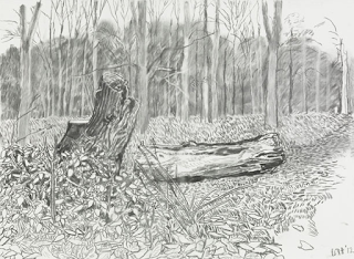
This drawing by David Hockney is called Vandalized Totem. It was made in November 2012 with charcoal. I picked this piece of his because I like how simple it is.It is impressive to me that he did this in charcoal, when I first looked at it I thought it was drawn with a pencil since the lines are very thin and seem to be clean. David was a big contributor in the pop art movement. In 2017 he had an exhibition at the Tate Britain, this was also when Hockney turned 80 years old. Overall I think Davids artwork is nice but he is definitely not my favorite.

Monday, April 16, 2018

David Hockney


This piece is called, "The Sermon on the Mount," which was painted by David Hockney. This piece in unlike most of his other work. It's very soft and light, which is what I like about it. It's also really cool that this painting is scene that has been painted many times before by many people. Every depiction of this historical scene is a little different, but they're all focused mainly on a similar set-up. This painting gives a slightly different perspective than most others that I saw, which is another reason that I like it.

David Hockney


This painting is called Portrait of an Artist (Pool with two figures) by David Hockney in 1972. The painting is set in France and depicts a male swimming in the pool with a male figure, meant to represent David Hockney's former partner, Peter Schlesinger, in a suit overlooking the pool. I like the landscape in the background of this painting because of its realism and the depth it possesses. I also really appreciate the pool and the refraction of the water with the sunlight. I picked this painting over his others because I enjoy the realistic qualities of the piece and the colors he chose to depict his scene.

Sunday, April 15, 2018

Picasso: Tête de Femme


The piece selected is called "Tête de Femme" which means "Head of a woman". I like this art piece because it really captures a female like figure. There is no great detail but the use of shapes in a somewhat abstract way brings the picture together. The piece was created in 1962 and was a rendering of Jacqueline Roque. The use of the different colors allows us to see two different heads in what may look like a kissing motion. The effect Picasso created with this piece was very innovative and phenomenal by Picasso. 

Wednesday, April 11, 2018

Picasso: Femme couchée et homme à la guitar


Picasso created "Femme couchée et homme à la guitar" in 1959. It depicts a woman reclining and a man sitting next to a guitar. I liked that the woman is more detailed than the man is in this work. I also liked that he stuck to shades of brown, rather than more colorful colors. I feel like it makes it easier to focus more on the figures involved.